Icon guidelines
Guidelines for using, creating, and requesting icons
Using icons #
Do
- Use icons as a simple graphical cue to quickly communicate an action, idea, or message
- Keep the default icon style unaltered
- Keep the default icon size unaltered
- Use accessible color combinations
Don't
- Use an icon without a text label unless the icon's meaning is common enough to be understood without text
- Alter the style of an icon by adjusting the corner roundness or stroke weight
- Stretch or scale an icon's size
- Alter default icon color states built into Rivet components
Creating icons #
Follow the guidelines below when creating your own icons for use in a Rivet project.
Icon style #
Icons should have sharp edges/corners and a 2px stroke weight (A) to visually align with IU’s trident and brand fonts. Outlined icons should be used whenever possible, while solid icons can be used for hover or selected states.
Icon size #
Icons should be drawn on a 16×16px artboard following a 16×16px grid (B) using keylines (C). The 16x16px size helps to create visual balance when used with our standard type sizes and helps ensure a clear and crisp icon.
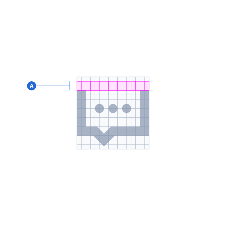 Style breakdown of a Rivet icon shown at a larger-scale for detail (16×).
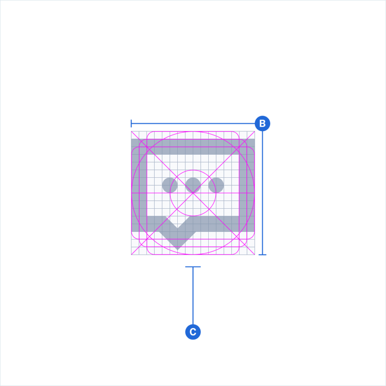 Size breakdown of a Rivet icon shown at a larger-scale for detail (16×).
Icon color #
Icons should use the built-in default and interaction states when used within a Rivet component (D). If you change an icon’s default colors, they must be accessible and conform to IU’s brand color palette. Visit the color utilities page to check color contrast.
Icon container #
Icons can be used on their own or placed (centered) within a circular container. The smallest container size should be 32×32px (E). The maximum container size should be 48×48px (F) to allow for adequate spacing around an icon.
 Color breakdown of a Rivet icon.
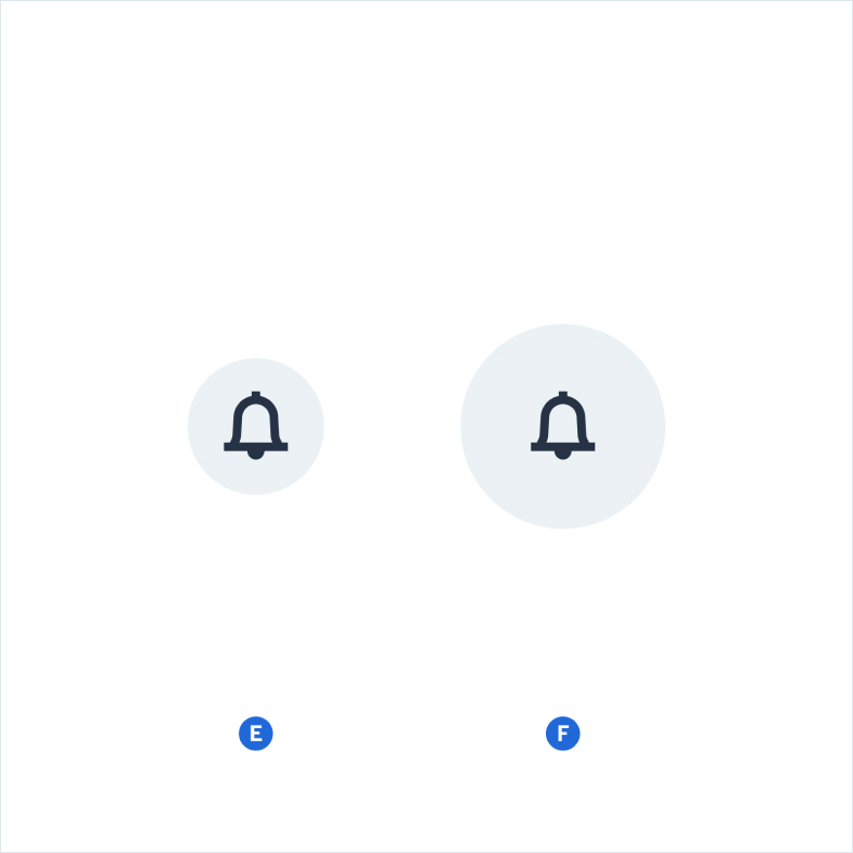 Container breakdown of a Rivet icon shown at a larger scale for detail (4×).
Requesting icons #
Icons are created by the Design Systems team using the Figma design application. The team has a particular production process to help ensure optimal results for developers and designers.
You may request an icon, but please read the following notes before submitting your request:
- Check to see if the icon you’d like to request already exists within Rivet’s icon library
- If multiple people are requesting the same icon, it will likely be prioritized over other icon requests
- Icon requests are not considered on a rolling basis. Instead, the Design Systems team evaluates all pending icon requests before each scheduled release. This means that if your icon request is accepted, it might not appear until a future release.
- The Design Systems team has discretion over which icons will be added to the library. Requesting an icon does not guarantee it will be created.