Blog
Getting the most out of the Rivet grid
Tips and best practices for laying out pages using the grid component
Scott Anthony Murray
Nov 12, 2024
The Rivet grid component is a flexible tool for defining the high-level layout of a page. Made up of containers, rows, and columns, you can use the grid to create a number of different layouts for websites and web applications.
This post will discuss several tips and best practices for effectively using the Rivet grid.
Containers can be used on their own #
Containers are the most basic unit of the Rivet grid. Use containers to set a maximum width for content and center it in the viewport. Containers are also responsive by default, shrinking to fit the width of the viewport on smaller screens.
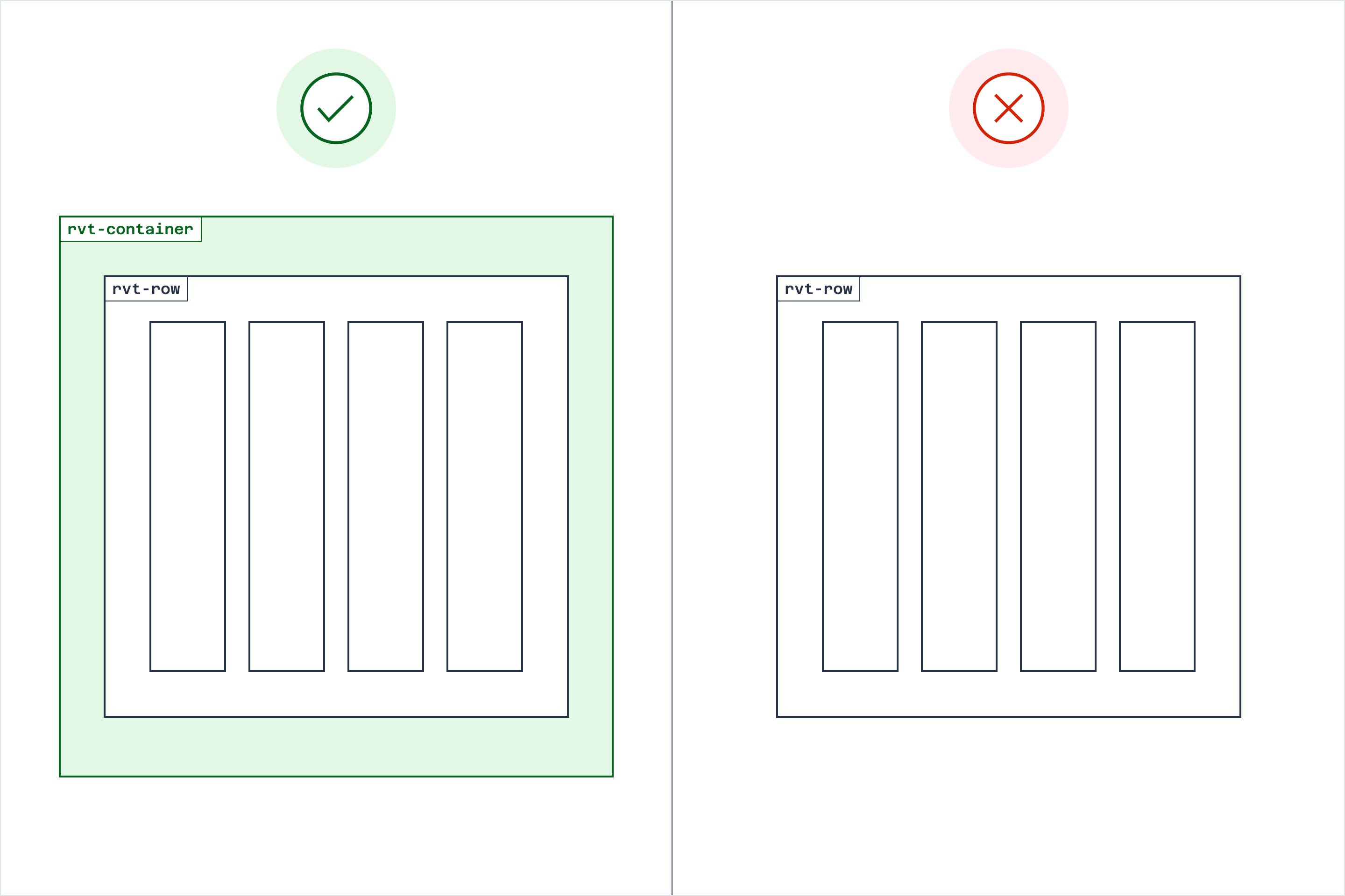
If you’re only displaying a single column of content within a container, you don’t need to put that content within a row or column element.
<!-- Do this -->

<div class="rvt-container-lg">
  <!-- Your single-column content -->
</div>

<!-- Don't do this -->

<div class="rvt-container-lg">
  <div class="rvt-row">
    <div class="rvt-cols-12">
      <!-- Your single-column content -->
    </div>
  </div>
</div>
If you’re putting running text within a container—such as the body of an article—consider adding the prose utility class to the container element to format that text automatically.
Always put rows in a container #
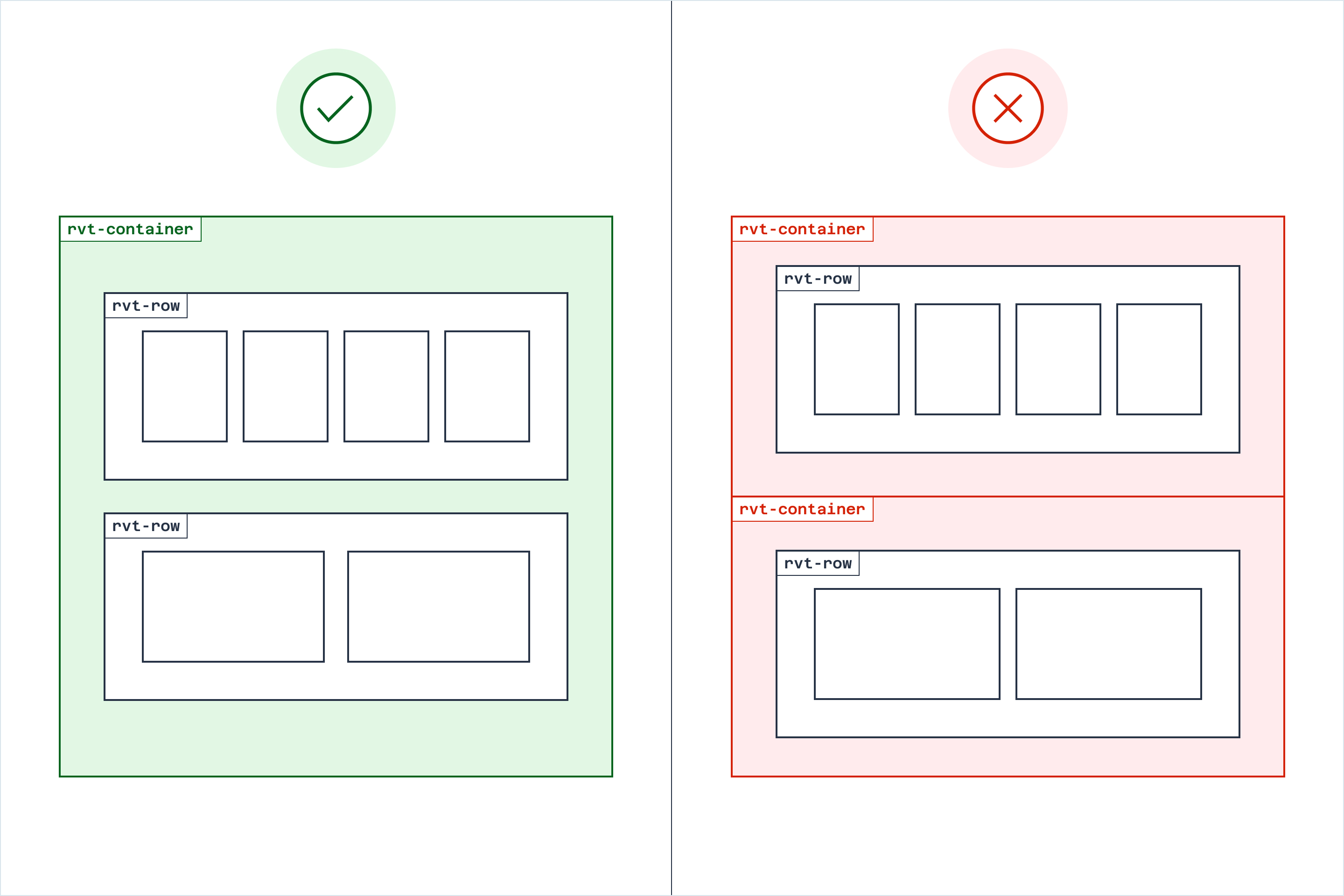
Row elements must always be the direct children of a container element. Likewise, column elements must always be the direct children of row elements. A container element cannot also be a row element.

<!-- Do this -->

<div class="rvt-container-lg">
  <div class="rvt-row">
    <div class="rvt-cols-8">
      <!-- Your content -->
    </div>
    <div class="rvt-cols-4">
      <!-- Your content -->
    </div>
  </div>
</div>

<!-- Don't do this -->

<div class="rvt-container-lg rvt-row">
  <div class="rvt-cols-8">
    <!-- Your content -->
  </div>
  <div class="rvt-cols-4">
    <!-- Your content -->
  </div>
</div>
Note that rows within a container do not all need the same number of columns.
For example, the first row in a grid might have two columns, the second row might only have one column, and the third row might have three columns. That said, always keep usability and accessibility considerations in mind when mixing and matching the number of columns.

Take advantage of responsive automatic columns #
Rivet allows you to specify explicit column widths within a grid row. Setting explicit column widths can be helpful if you need fine-grained control over each column’s proportions at various breakpoints.
However, you might find that using automatic responsive columns saves you time and helps make your markup more succinct. You can also mix automatic and explicit column widths in a single grid row if you need to control the proportions of only some columns but not others.
Avoid deeply nested grids #
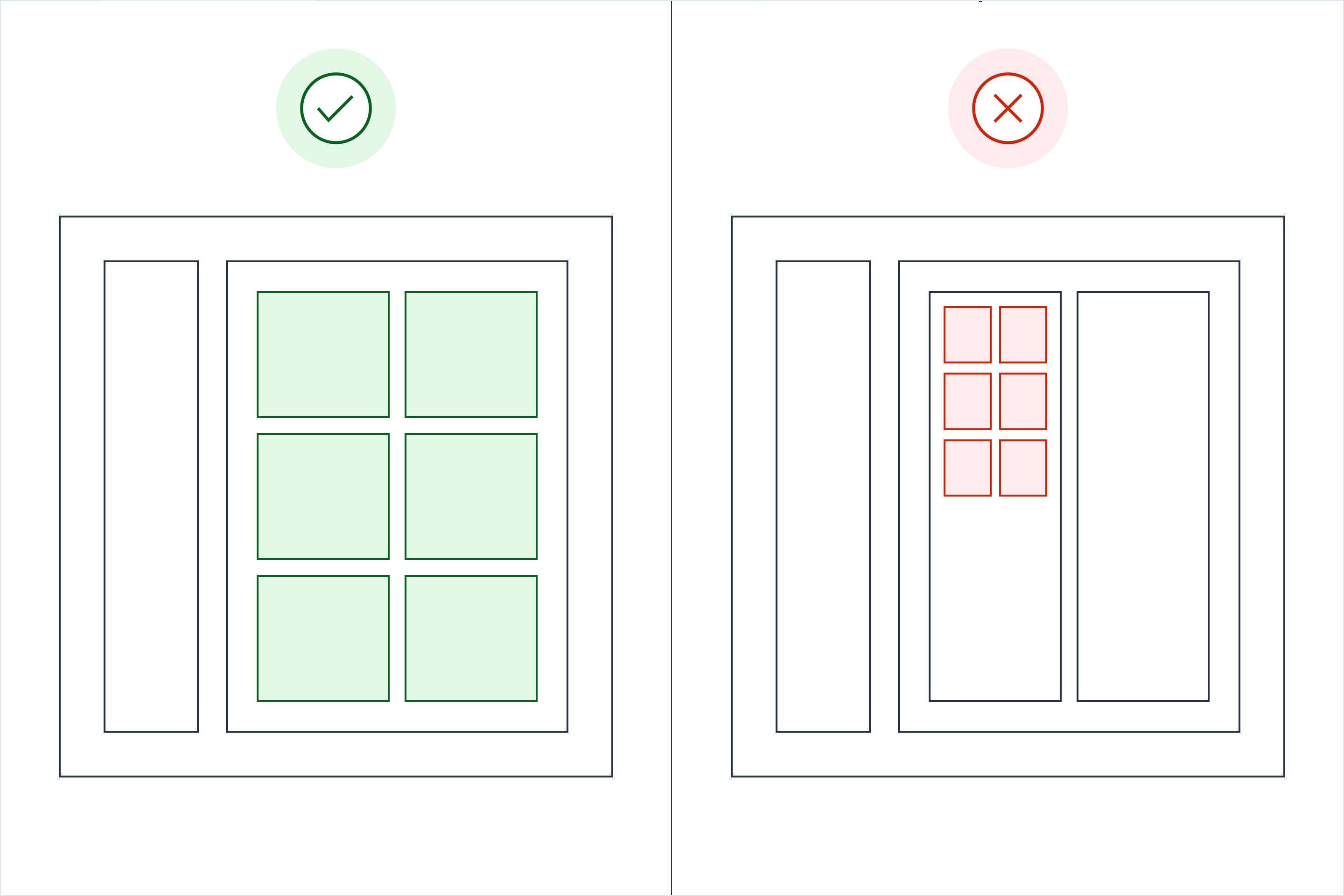
Rivet allows you to nest grids within a single container. You do not need to wrap a nested grid within a second container element.
Avoid nesting grids more than two levels deep. Doing so can cause usability and accessibility issues, particularly on smaller screens. If you need to fine-tune the layout of individual components within a nested grid, use Rivet’s flex utilities instead.

Wrap containers in divs to add full-width background colors #
It’s a common pattern on single-column pages to use alternating section background colors or call out important sections with a bold background color like crimson.
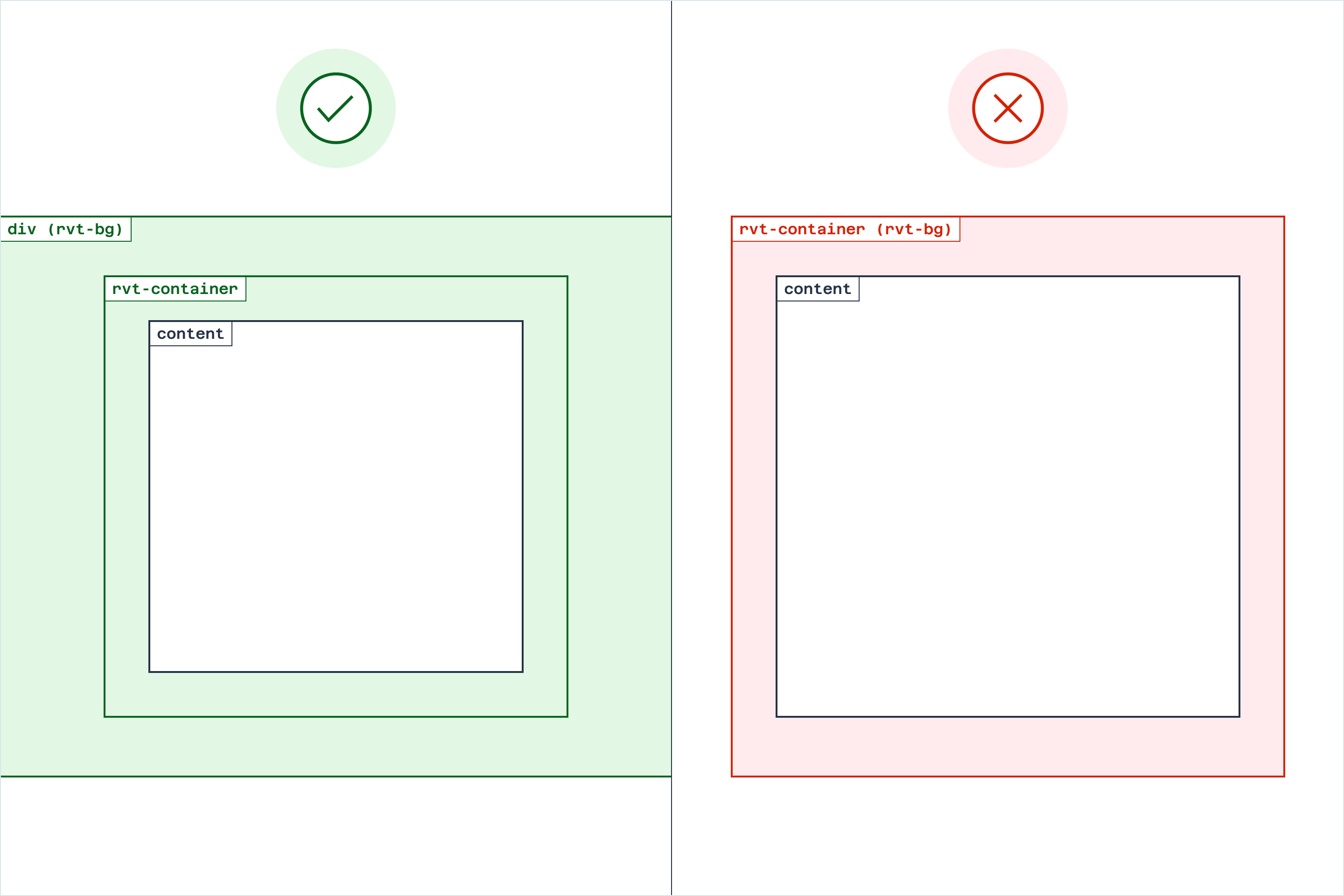
When using this pattern on your own pages, avoid putting the background color on the container element itself—doing so will cut off the background color at the edges of the container. Instead, wrap the container in a plain div and apply the background color to that element.

<!-- Do this -->

<div class="rvt-bg-black-000 rvt-p-tb-xxl">
  <div class="rvt-container-lg">
    <!-- Your content -->
  </div>
</div>

<!-- Don't do this -->

<div class="rvt-container-lg rvt-bg-black-000">
  <!-- Your content -->
</div>
Start with a prebuilt Rivet layout #
While you can use the grid to create your own page layouts by hand, consider saving time by using one of Rivet’s prebuilt page layouts instead.
These prebuilt layouts range from blank one- and two-column pages to more complex card lists and application dashboards.