Components
Modular elements you can combine to create website and web application interfaces
-
The Accordion component uses JavaScript
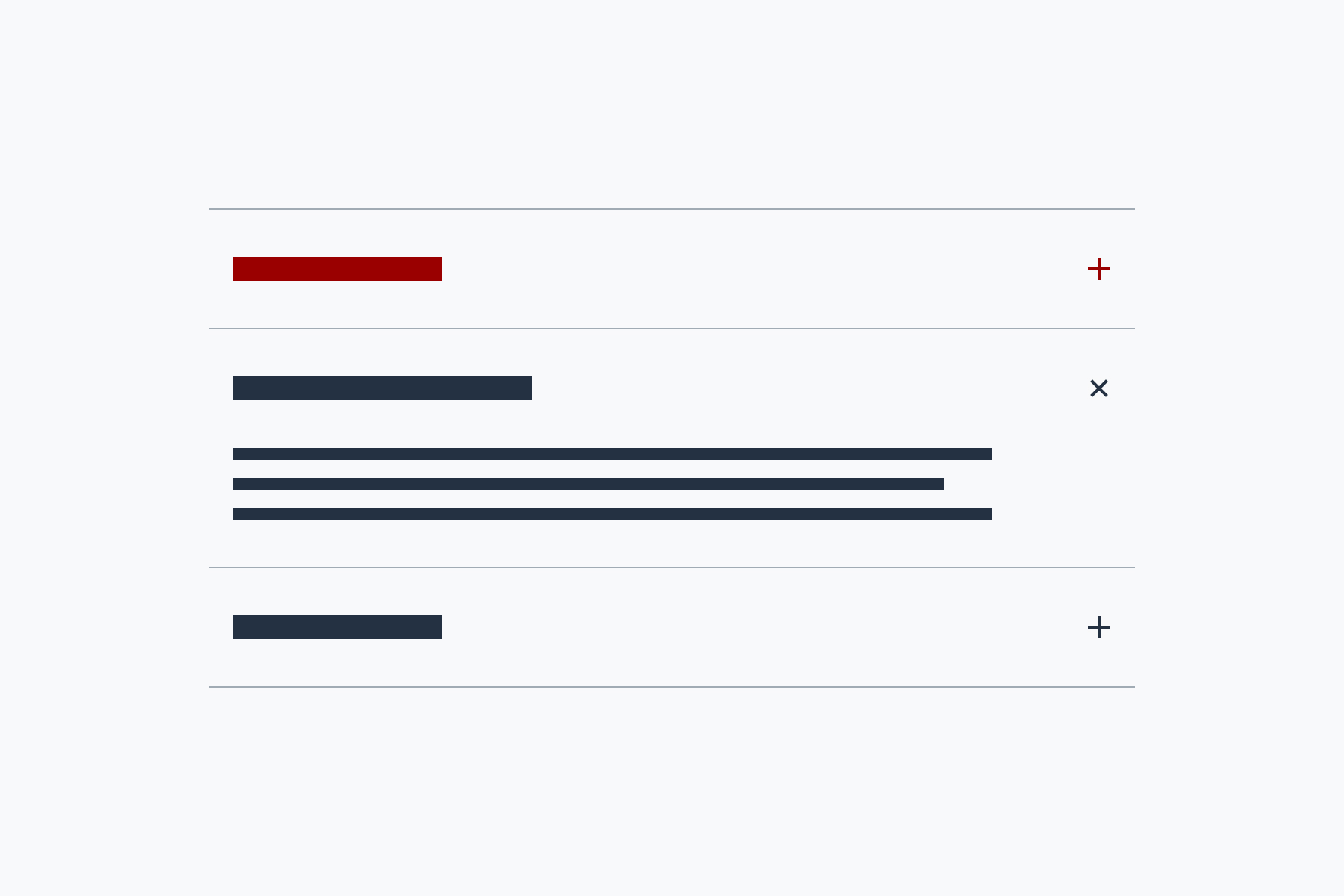
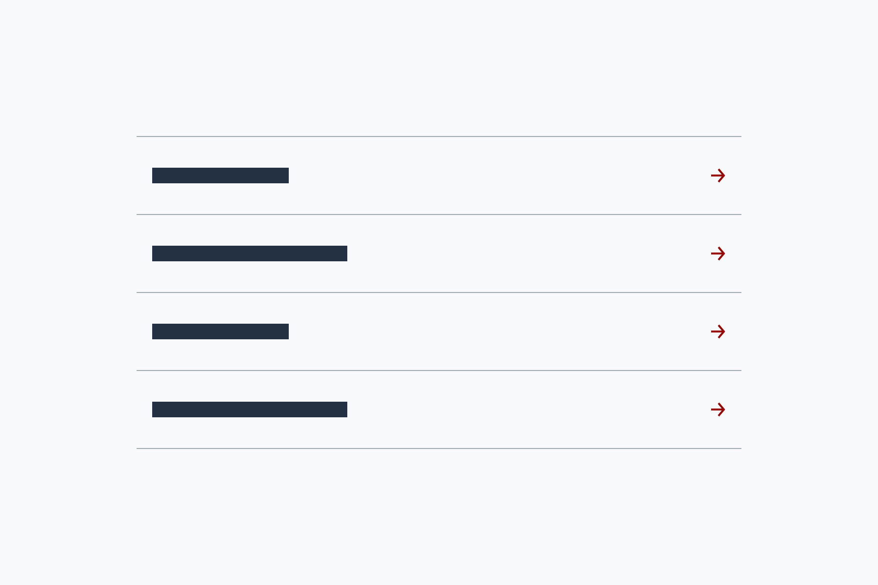
Accordion
Group content into sections that can be opened and closed
-
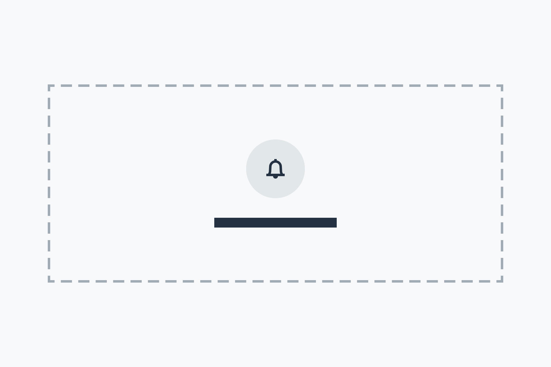
The Alert component uses JavaScript
Alert
Display brief important messages to users like errors or action confirmations
-

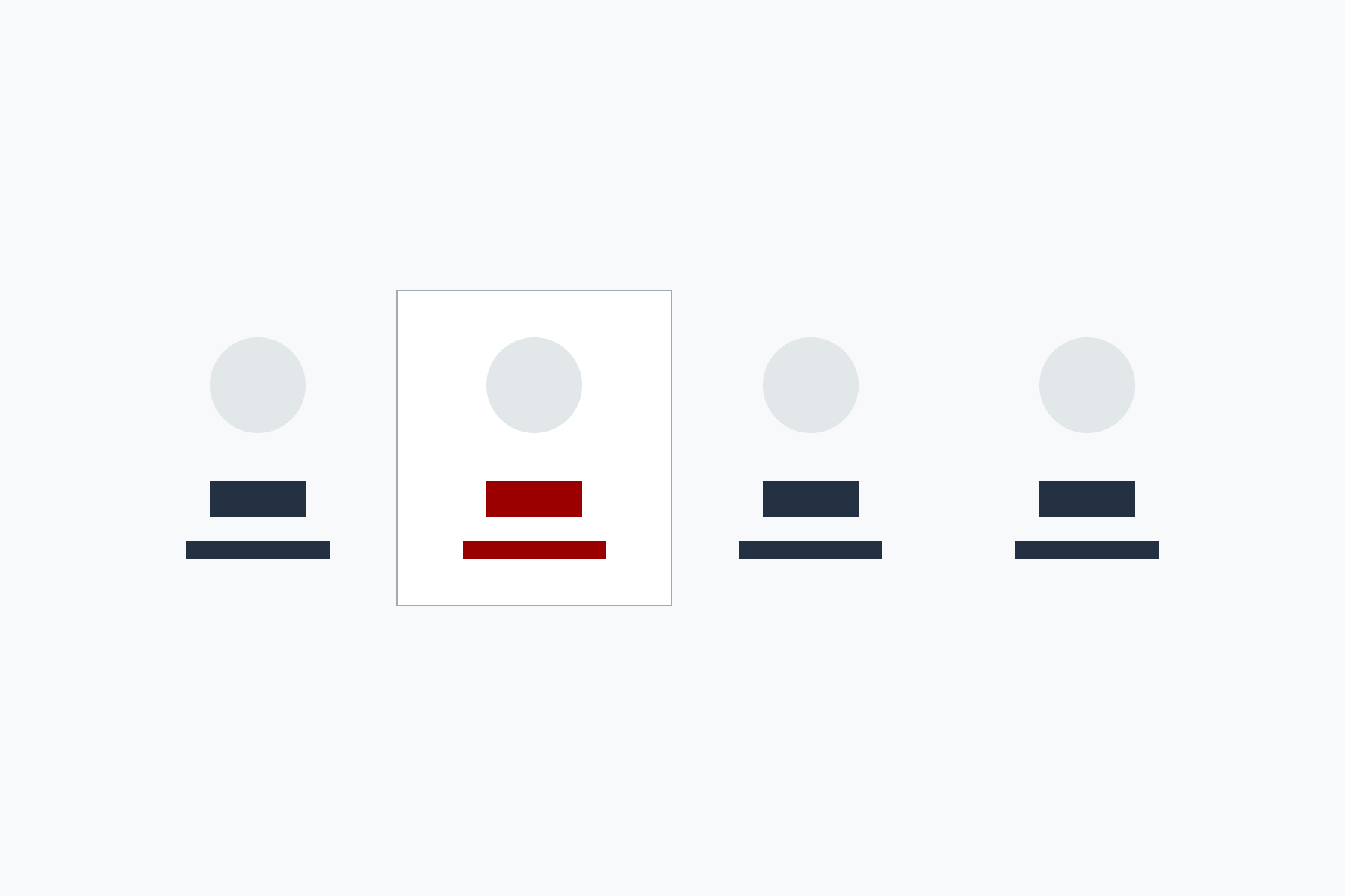
Avatar
Display a person's picture or initials
-

Badge
Annotate important information, highlight new information, or convey status
-
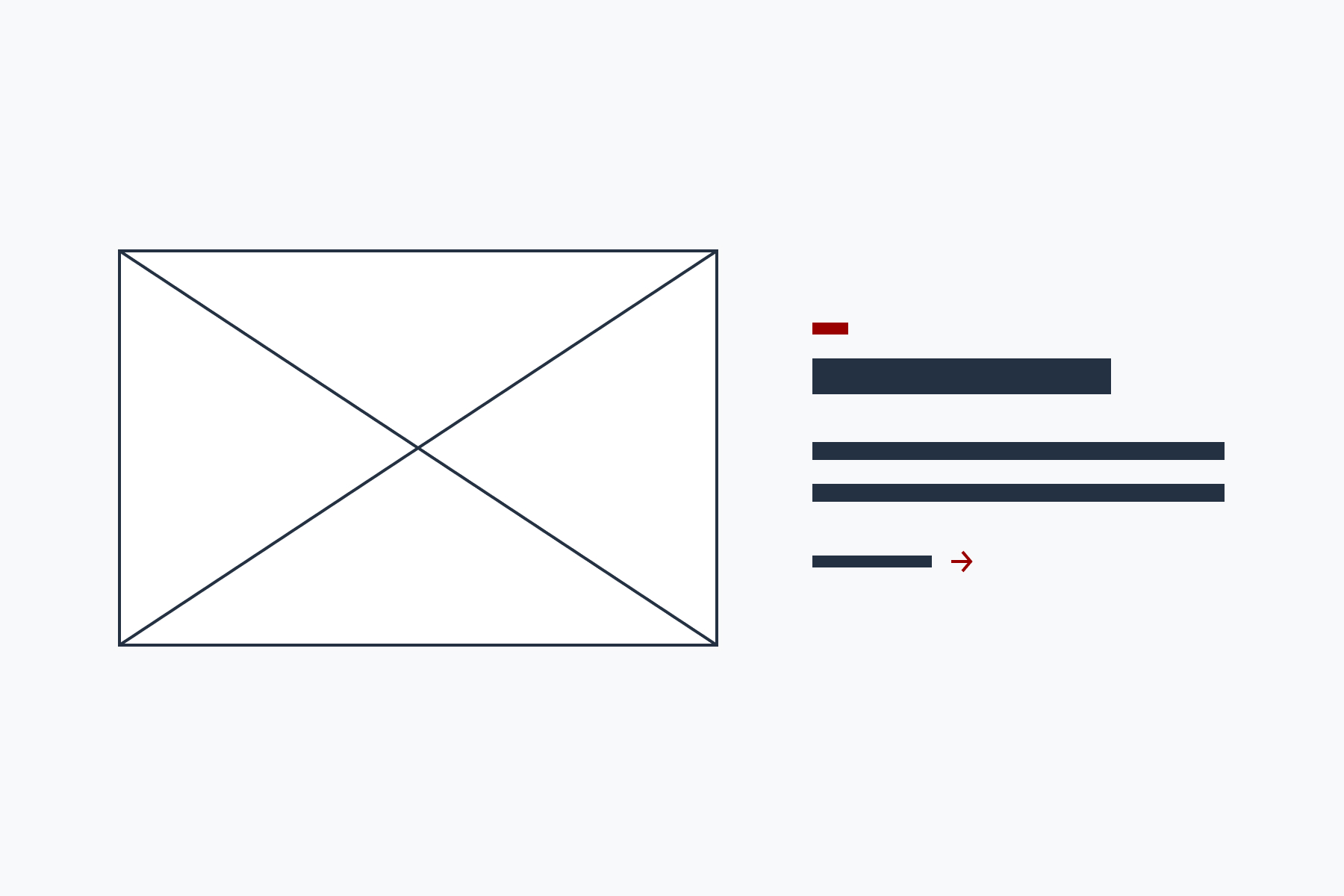
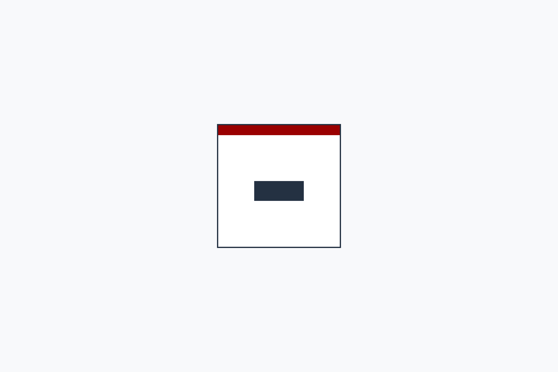
Billboard
Highlight content with an image, text summary, and call to action
-
Breadcrumbs
Show the user's current location in a page hierarchy
-

Button
Highlight an action the user can take, such as submitting a form
-
Calendar tile
Highlight an important date
-

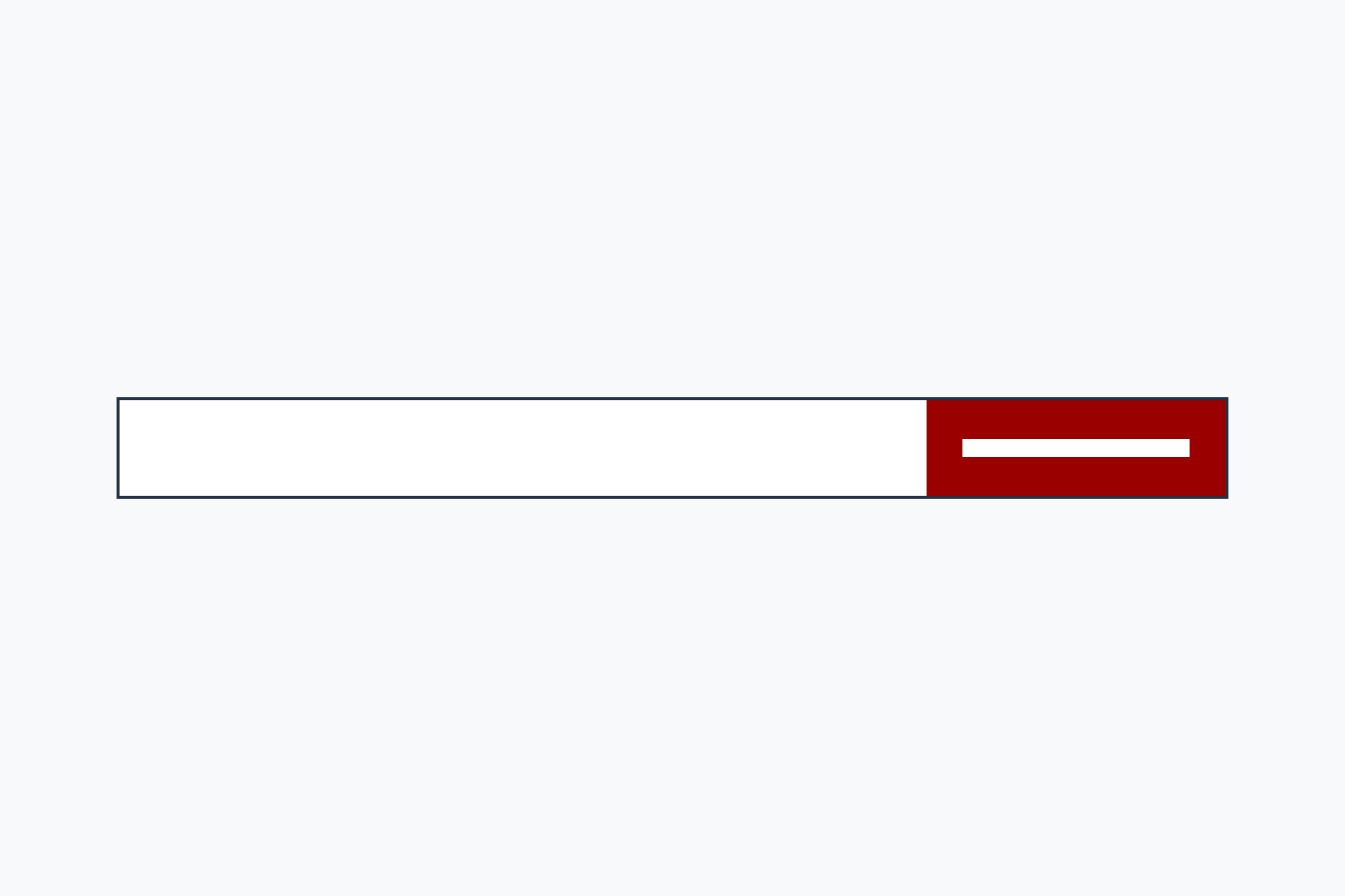
Call to action
Add a link with extra visual emphasis
-
Card
Group related content or present content as a list or grid
-
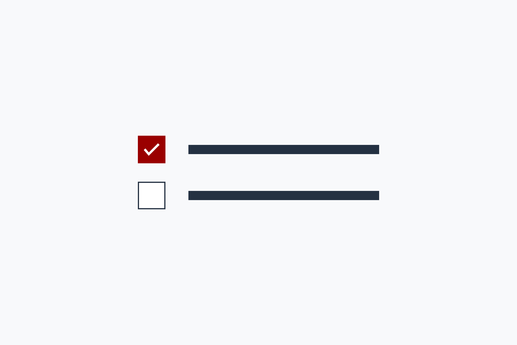
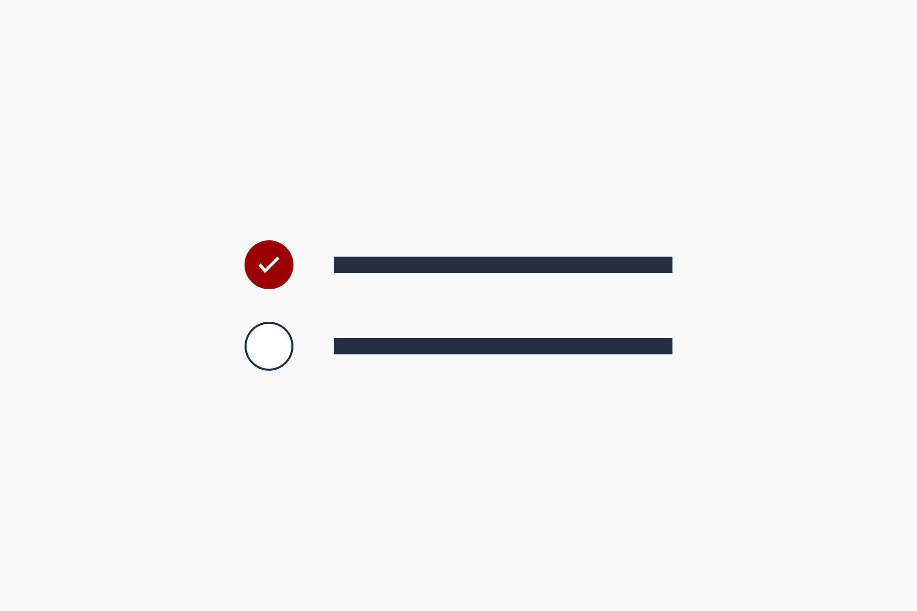
Checkbox
Allow users to select zero, one, or many options from a list of choices
-
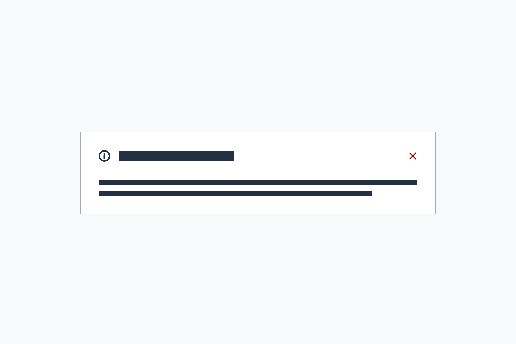
The Dialog component uses JavaScript
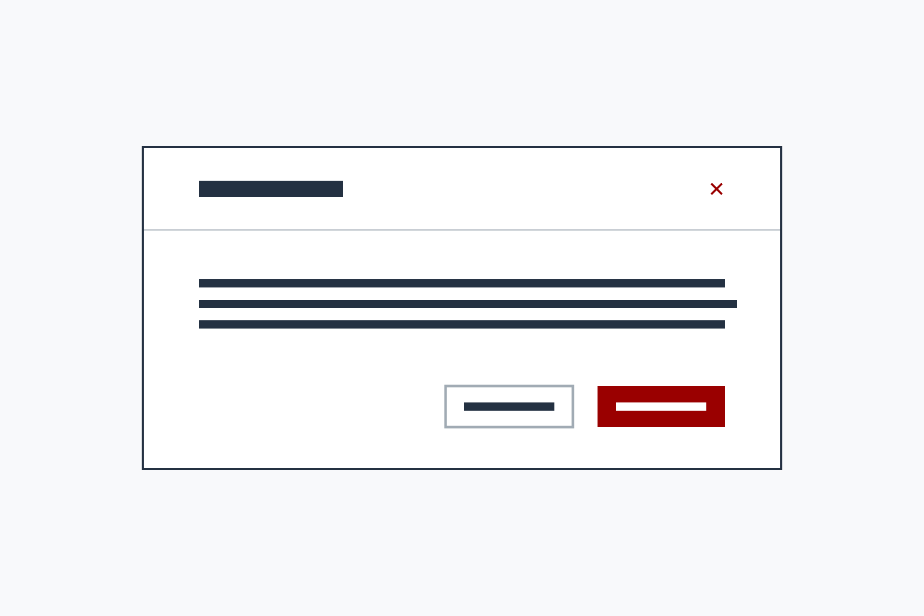
Dialog
Present content in a smaller window that is displayed on top of the main application or site content
-
The Disclosure component uses JavaScript

Disclosure
Allow the user to show or hide additional content about a topic
-
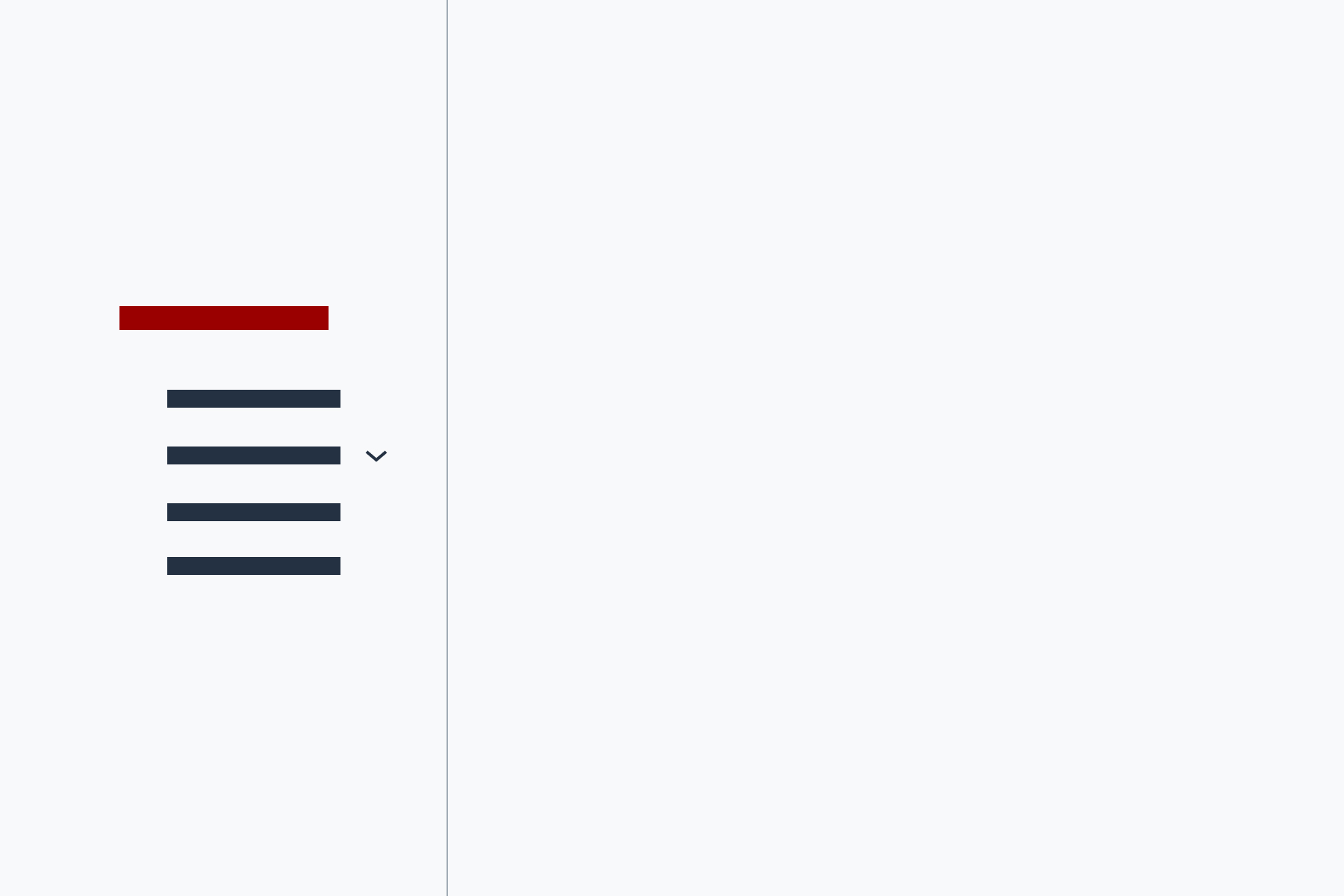
The Dropdown component uses JavaScript

Dropdown
Present a list of options that can be shown or hidden with a button
-
Empty state
Show a placeholder and suggest first steps when there is no content
-
The File input component uses JavaScript

File input
Allow a user to select a file to be uploaded as part of a form submission
-

Footer
Add an IU-branded footer to your website or application
-

Grid
A 12-column responsive grid for laying out pages
-
The Header component uses JavaScript
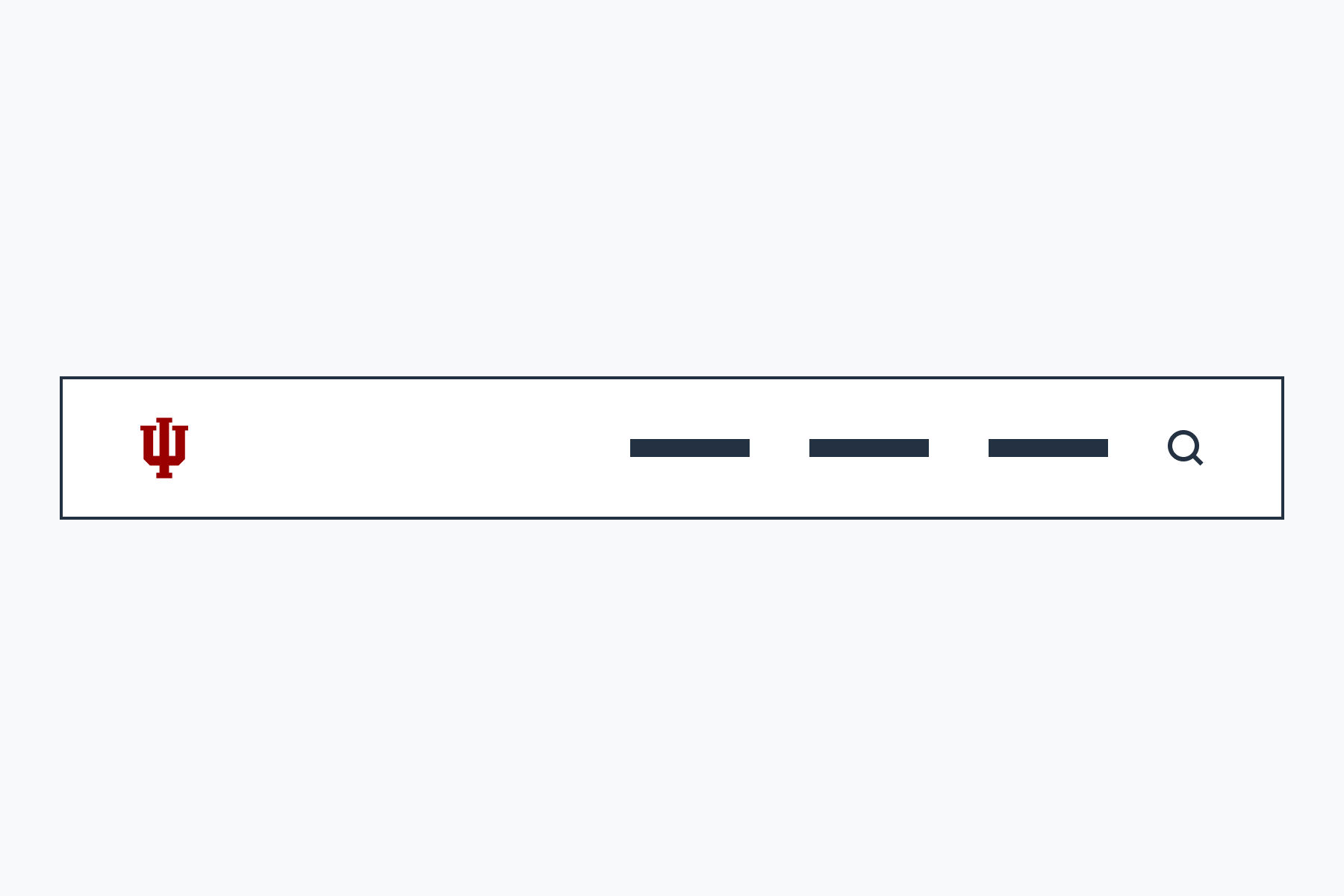
Header
Add an IU-branded header and navigation to your website or application
-
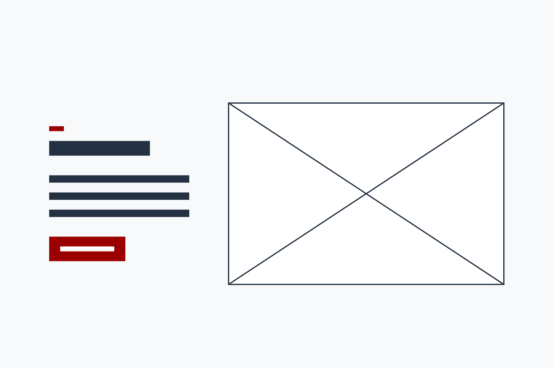
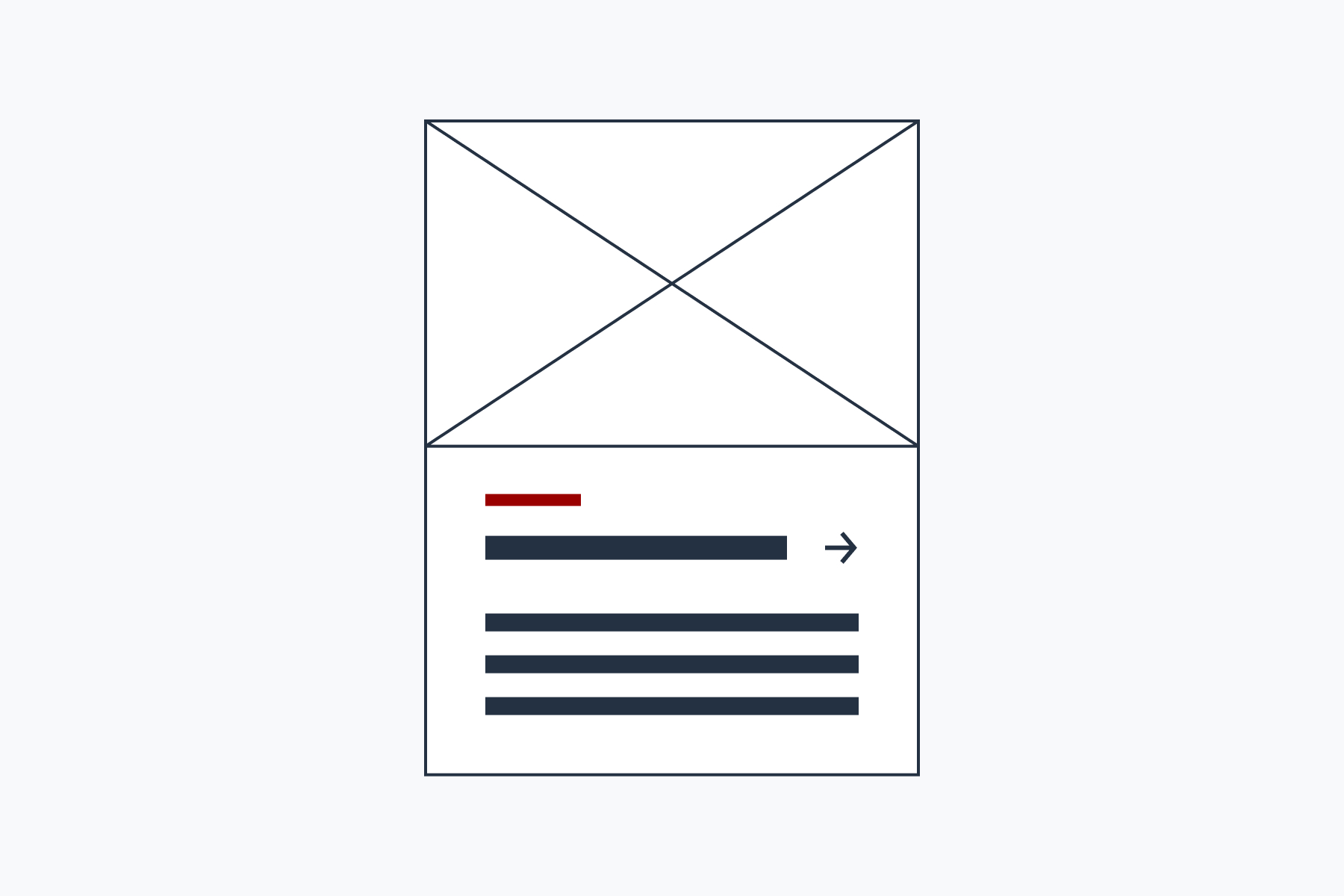
Hero
Prominently show a title, summary, image, and call to action at the top of a page
-
Input group
Group related form inputs
-
Link hub
Show a list of links with optional descriptions
-

List
Group and organize lists of content
-

Loading indicator
Show users that content is loading or an action is being processed
-
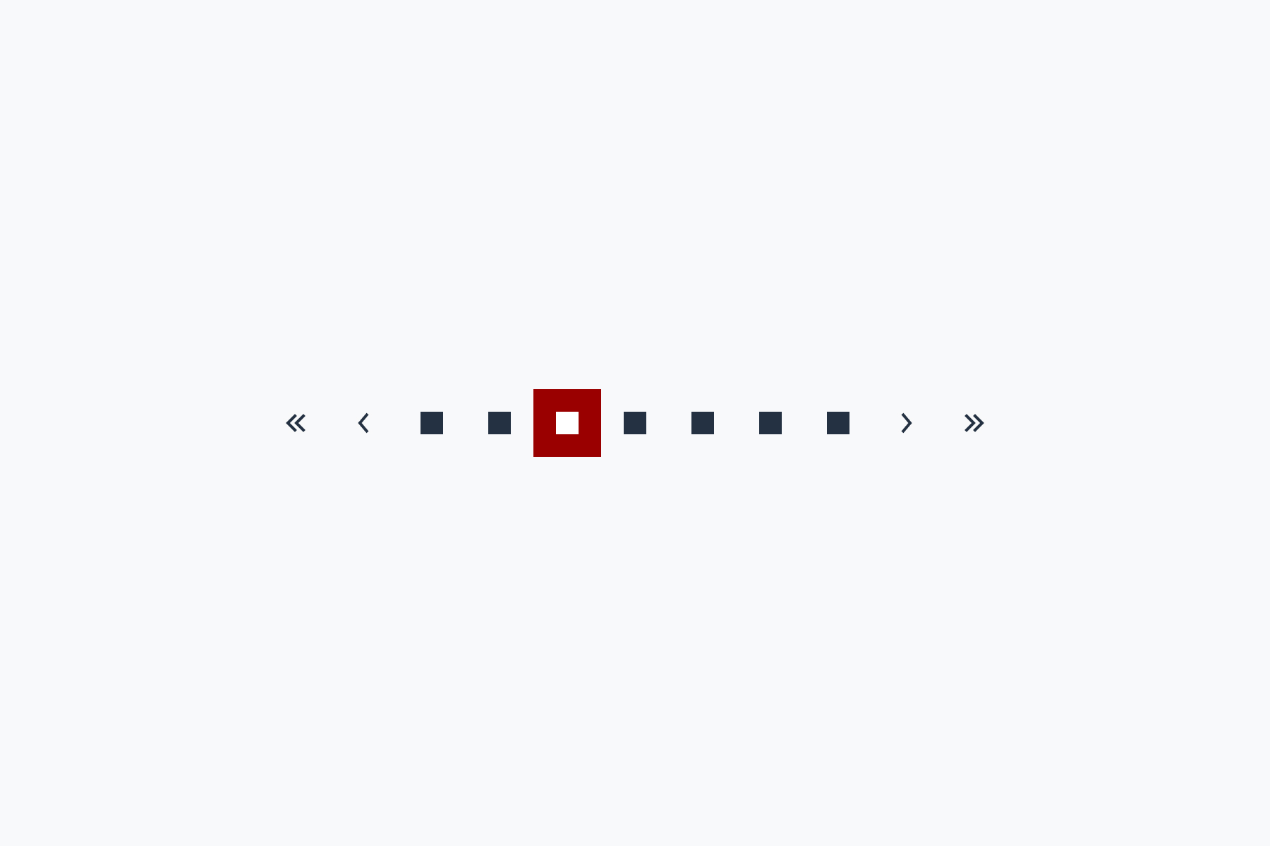
Pagination
Allow users to move between multiple pages of content
-

Quote
Highlight a compelling quotation
-
Radio input
Allow users to choose a single option among many
-
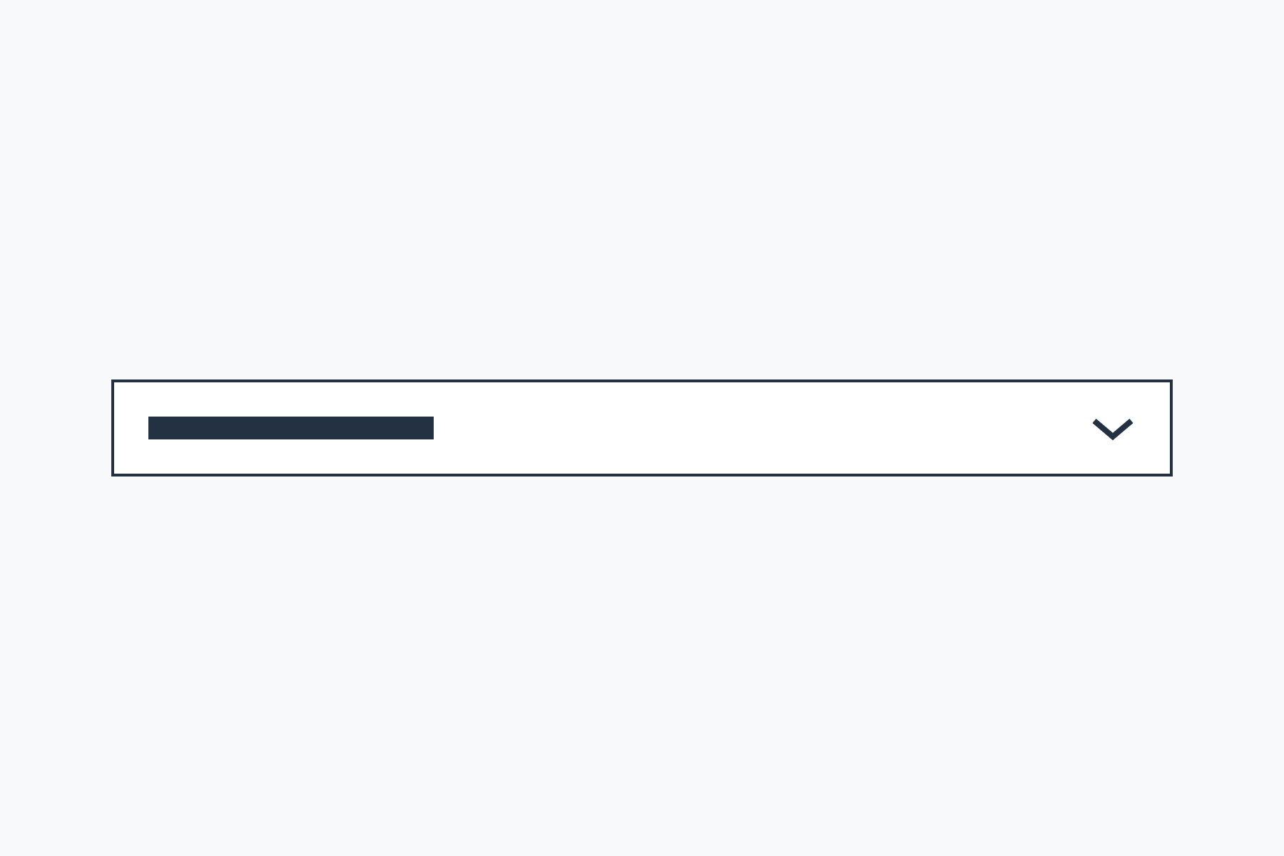
Select input
Allow users to choose one option from a dropdown list
-
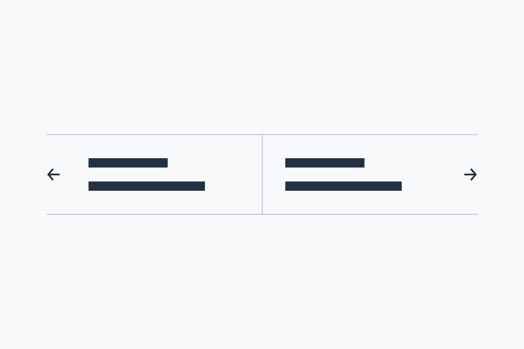
Series nav
Allow users to step forward or backward through a series of content pages
-
The Sidenav component uses JavaScript
Sidenav
Create a vertical list of navigation links for use in a sidebar
-
Stat
Highlight one or more compelling statistics
-
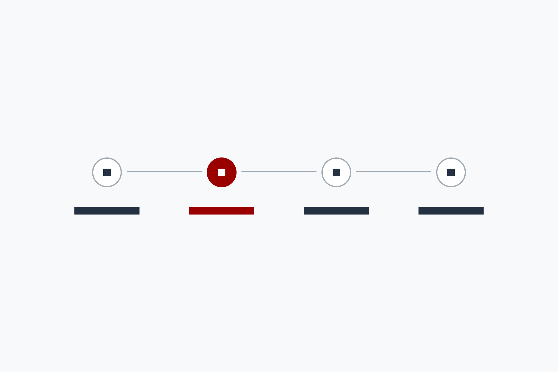
Step indicator
Show the user's position in and progress through a multi-step process
-
Subnav
Provide additional navigation outside the main header or sidenav
-
The Switch component uses JavaScript

Switch
Allow users to toggle a configuration option between "on" and "off" states
-
Table
Present tabular data in rows and columns
-
The Tabs component uses JavaScript
Tabs
Allow users to switch between related groups of content without having to leave the page
-
Text input
Allow users to enter single-line text content to be submitted as part of a form
-
Textarea
Allow users to enter multi-line text content to be submitted as part of a form
-
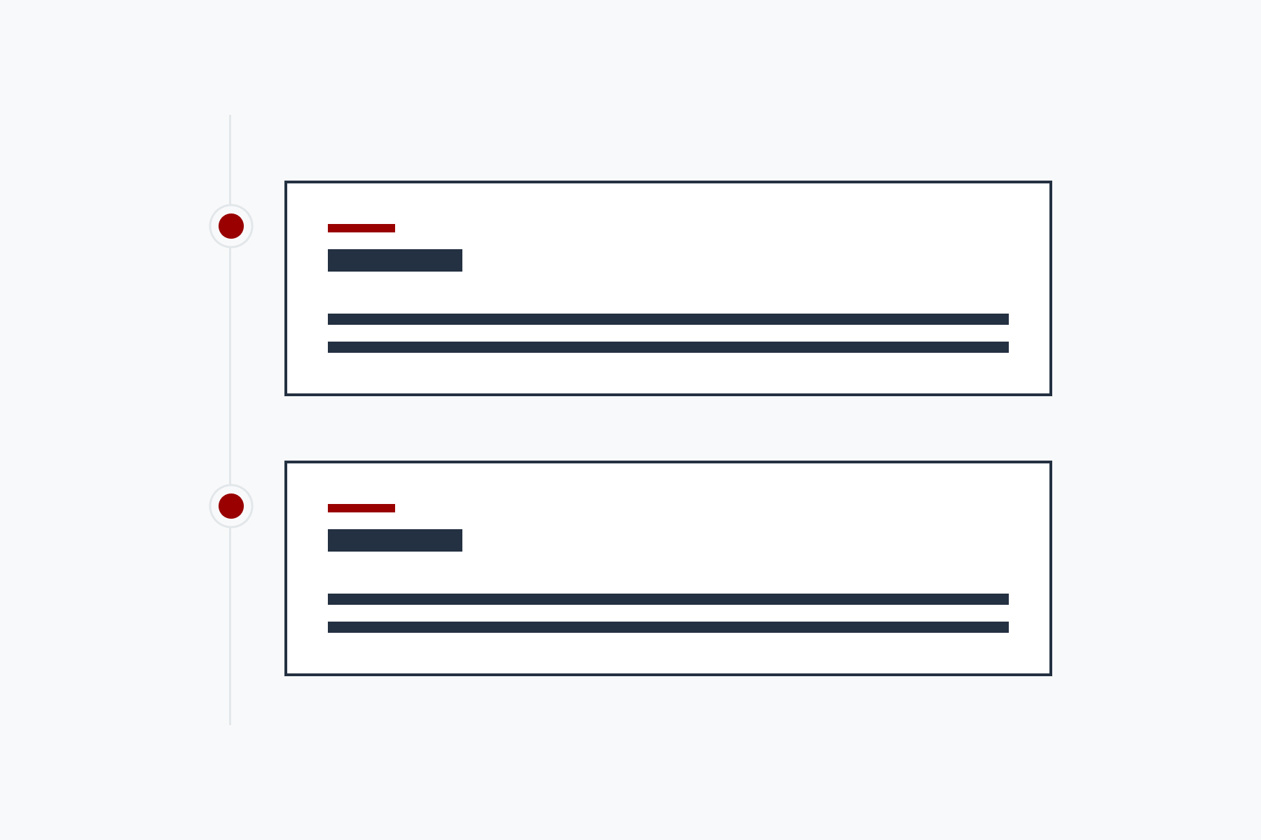
Timeline
Show a chronological series of events and highlight milestones