Rivet design kit
Resources and tools for prototyping with Rivet
Overview #
What are Figma libraries? #
Figma libraries are comprised of components and styles that are reusable and accessible through the Figma design application.
Why use Figma libraries? #
- Quickly design and prototype accessible pages utilizing Rivet styles and terminology that developers will understand
- Ensure consistency across IU digital interfaces by using 1:1 Rivet styles and components
- Get automatic design updates made by the Rivet team
Installing Figma libraries #
1. Request library access #
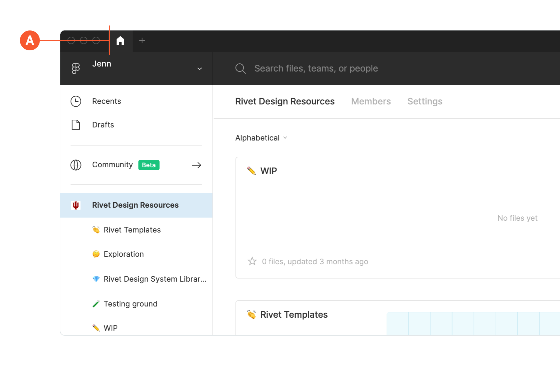
To use the Rivet design libraries, you must first request access to join the Rivet Design Resources team in Figma.
You may only request access for users with an IU email address.
Once access has been requested, a Rivet team member will grant you access and you will receive an email inviting you to join the Rivet Design Resources team.
2. Enable the libraries #
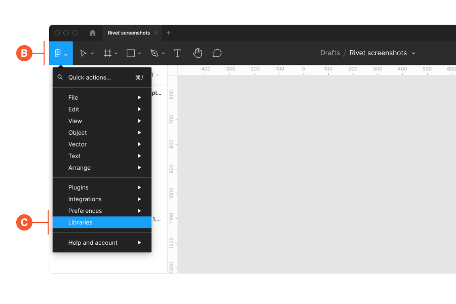
Open a new design file within Figma using the plus icon located next to the home icon at the top of the app (A) .
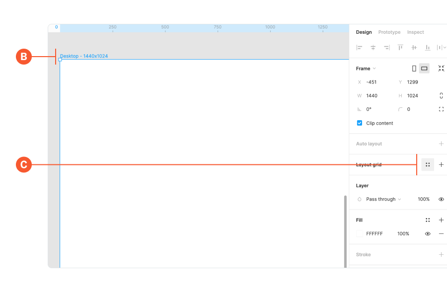
In your new file, open the main menu within the toolbar in the top left (B). Scroll down to the bottom of the list and select libraries (C).
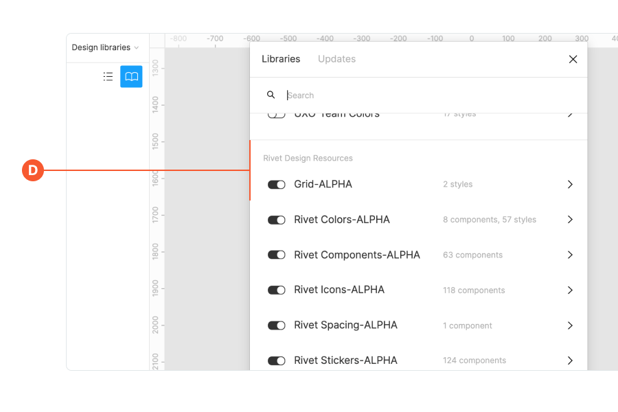
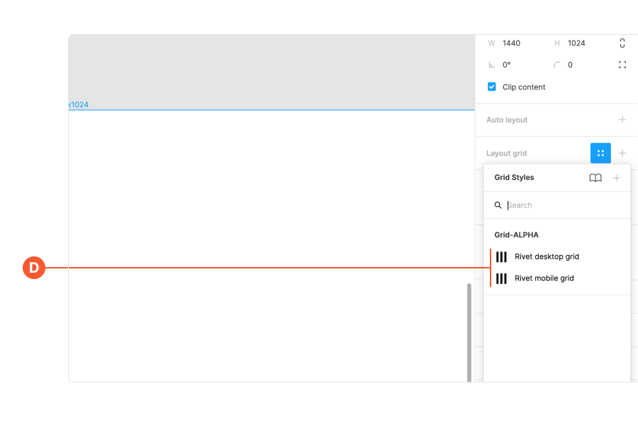
Find the Rivet Design Resources section inside of the dialog and switch all of the available libraries on with the toggle (D).
3. You’re ready to use the Rivet libraries 🎉 #
Keep reading to learn more about individual libraries or reach out to the Rivet team with questions.
Check out Figma’s documentation to learn more about using components and styles.
Quick guide to individual libraries #
Components #
The component library includes all documented components within Rivet, including variants. To use a component, go to the Assets panel within the left sidebar and select Rivet Components from the list. There are a few things to note about the component library:
- There is a Tips and info component at the top of the components list, drag this onto your canvas to get started.
- Next to each component is an icon denoting if it is built for mobile, desktop or both.
- Each component contains a tooltip on how to use it.
To see full Rivet documentation on any component visit the Components page.
Design tokens #
Most of the Rivet design tokens are included in the library as styles. You have access to grid, typography, colors, shadow and spacing that are all consistent with Rivet documented values.
Grid #
Each component was built using a specific desktop grid and mobile grid.
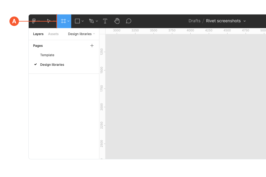
- Create an artboard by selecting the Frame icon within the top toolbar (A).
- Select the Desktop frame from the right sidebar under Desktop or select the iphone 8 frame under Phone.
These two grids can be used by selecting your artboard frame (B) then selecting the Style icon next to Layout grid (C).
This will bring up the Grid Styles menu, find the Grid label and choose between the Rivet desktop or Rivet mobile grid (D). You can toggle grids on and off by selecting your frame and pressing control + G.
Typography #
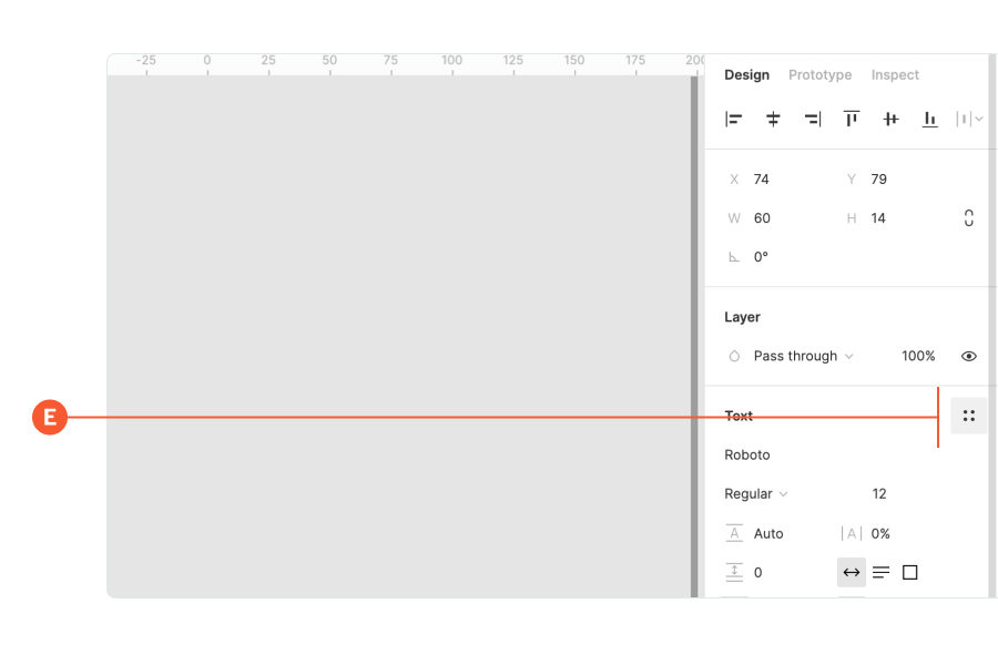
To use Text Styles, select the T within the top toolbar and type something. Change the font by selecting the Style icon next to the label Text in the right sidebar (E).
You can use any of the listed fonts under Rivet Typography, which includes BentonSans and Georgia Pro.
Color #
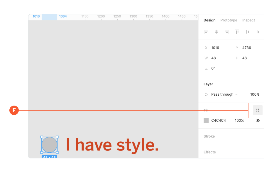
To use the Color Styles, create an object or type something, then apply color by selecting Color Styles in the right sidebar (F).
You can use any of the listed brand colors and tints under Rivet Colors as long as color combinations meet accessibility standards.
For more information on official colors visit the IU Brand site.
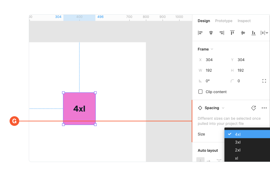
Spacing #
You can drag out a spacing block to control the padding or white space between design elements in your design.
The spacing block can be found under the Assets panel in the left sidebar labeled Rivet Spacing. Drag the block on to your artboard and choose the size using variant controls in the right sidebar (G).
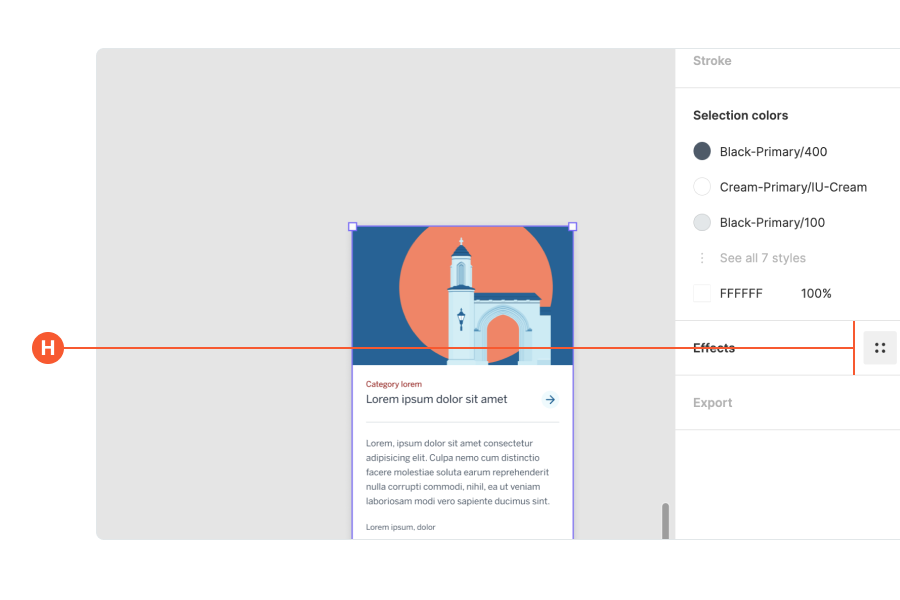
Shadow #
Add a subtle, standard, or heavy shadow to your design elements by using the Effects panel found in the right sidebar (H).
To see full Rivet documentation on any of the design tokens visit the Design tokens page.
Layouts #
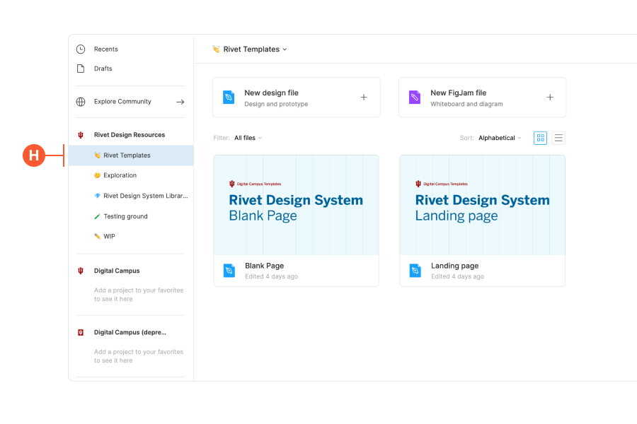
Pre-built layouts are available as a starter shell for your design or prototype.
Copy and paste any of the available layouts from the Rivet Templates section in the Rivet Design Resources team into your project (I) (shown above).
See Rivet layouts to find out more and explore what’s possible.
Icons and stickers #
Icons and stickers are available under the Assets panel and can be used as a visual way to communicate a message or an idea.
Icons #
Icons should only be used as small visual affordances that help users understand a UI element more clearly and are used to alert or prompt an action (I).
Documentation for developers on how to implement Rivet icons can be found on the icons Github repository.
Stickers #
Stickers should be used for more illustrative purposes to help draw attention to information or sections of a page (J).
You can use all brand stickers and each of their 5 variants (K) listed under Rivet Stickers. To change the variant of a sticker, drag out the desired sticker onto your canvas and select the variant using the variant controls in the right sidebar (L).